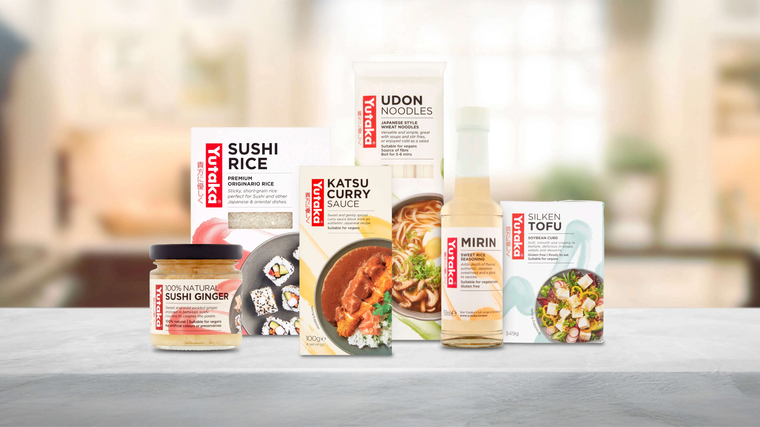
Brand and packaging redesign for the leading Japanese ingredient brand.
Trusted by restaurants and consumers alike, Yutaka has been the go to brand for Japanese ingredients in the UK since 1995. Creating meal kits and easy to use ingredients to recreate authentic Japanese cuisine at home.
The brand felt dated with the dark packaging and silver strip. To bring this sleeping giant up to date, we dug deep into its roots and used authentic Japanese caligraphy alongside tasty meal shots to excite customers.
Designed at This Way Up.


Yutaka, meaning ‘good harvest’, is a renowned Japanese ingredient and cooking brand, with a particularly strong position in food service and wholesale. However, with growing appreciation of oriental cuisines and more adventurous home cooking.
The strategy was ‘the art of Japanese food made simple’, giving a cuisine often perceived as complex and out-of-reach, a feeling of accessibility and ease, whilst cherishing the intrinsic Japanese visual themes of order, elegance and restraint.


