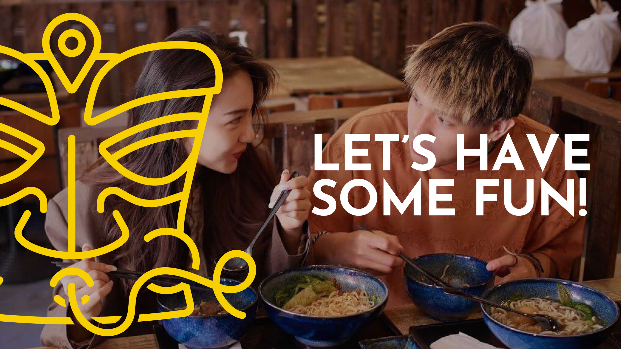
Chew Fun is a Chinese noodle restaurant based in east London. They specialise in creating Mi Fen noodles, known in the West as Fun noodles. They wanted us to help localise them and their unique product to the English market.
I set out to create a bold logo that was in English yet had the characteristics of Chinese characters. Chew Fun’s mascot is based on the ancient San Xing Dui. They were thought to have been created around 3000 BC in the Shu dynasty in the region where this cuisine originates. The new brand icon fuses history with the fun, light-hearted nature of the brand.
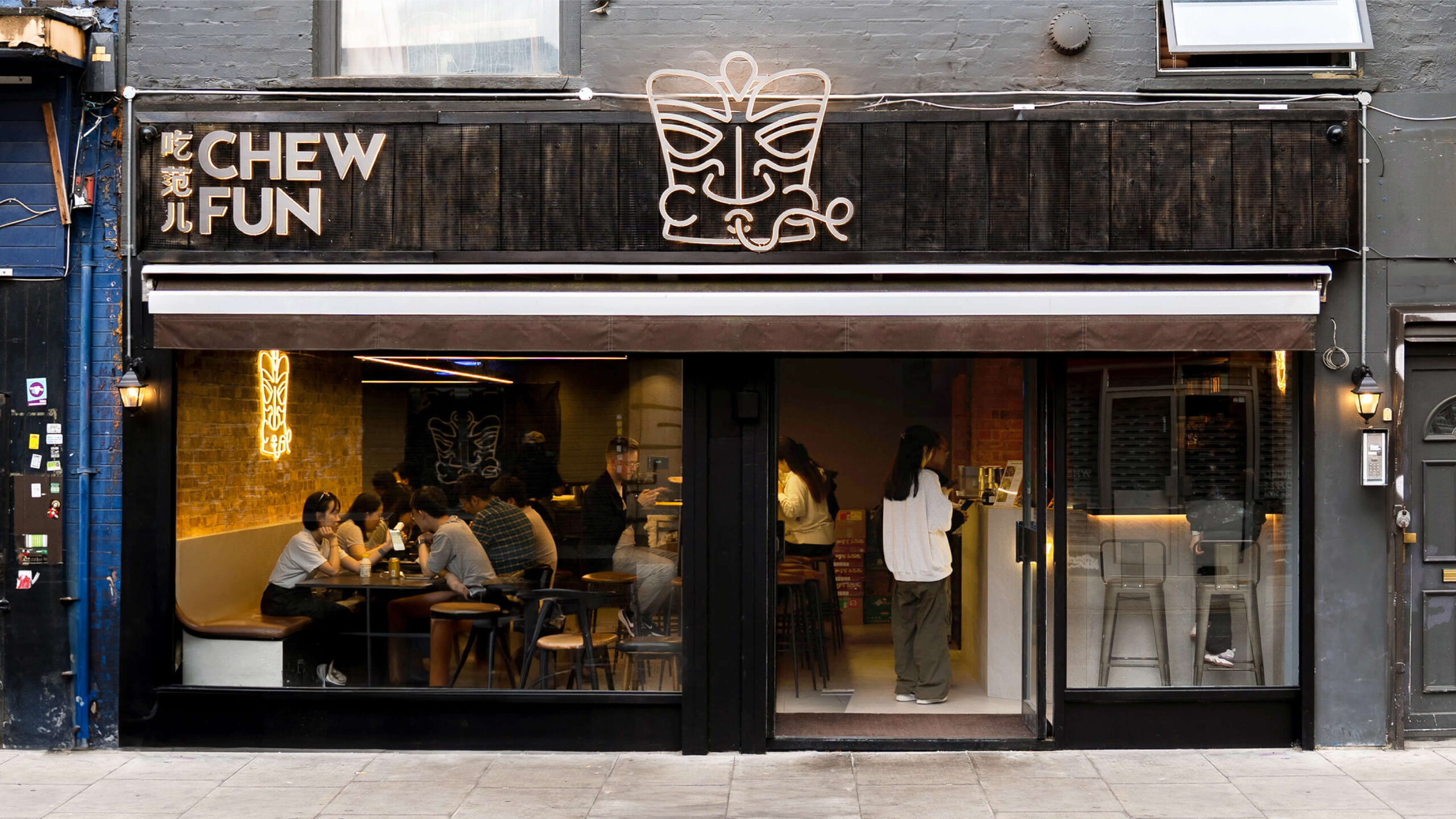
I collaborated with the amazing team at ili architects to bring to life Chew Fun’s new restaurant interior and exterior signage.
We used neon signage, textured surfaces and other little finishes to capture a warm and approachable environment.
“Working with Charlie is a real joy. We have a great spark between us that generates outcomes that never fail to impress me. I look forward to every meeting we have.”
Don Chen Owner, Chew Fun
From the style of the new icon, I created a suite of illustrations including a repeat noodle pattern for texture and a selection of icons for the menu and beyond.